A precise promise
Name the category and audience immediately. “HR for teams in India and the US.” gives Birch a more specific starting point than a broad promise about growing teams.
The approach
A persuasive B2B website does not need every element to compete for attention. These five principles guide the Birch redesign.
Name the category and audience immediately. “HR for teams in India and the US.” gives Birch a more specific starting point than a broad promise about growing teams.
Lead with verifiable product facts before the feature tour. Free access, trial terms and regional coverage are more useful than unsupported trust signals.
Alternate a strong statement with supporting evidence. Give each idea a different weight, rather than repeating equally dense sections.
Use one motion language sparingly. A headline reveal, verified number or single product diagram should direct attention, not make everything move.
Pair generous typography and short support lines with real interface fragments. Let useful product detail replace repetitive icon-and-bullet feature cards.
The guiding question
Can a visitor understand the promise, check the evidence and choose a next step?
Our website servicesMessage before decoration
The proposed opening makes Birch’s audience explicit: teams in India and the US. The supporting story should explain relevant compliance coverage in concrete terms, rather than rely on a generic HR software headline.
From there, the page moves between short statements, outcome cards and product detail. A restrained grain treatment is proposed for the hero, while plain sections give important sentences space.
Product narrative
“One record, five jobs.”
A single layered diagram can introduce the connected product story without turning the page into a catalogue of separate features.
Birch product facts
The proposal uses billing-backed facts instead of customer logos or ratings. These are Birch’s product terms, not Alderr & Page website packages.
10
employees free, forever
14 days
of Pro, no card
2 months
free on annual billing
INR · USD
priced per region
The implementation imports FREE_EMPLOYEE_LIMIT, TRIAL_DAYS, ANNUAL_MONTHS_CHARGED and PRICING from the billing configuration so the website stays aligned with the product. Count-up motion is reserved for these verified figures.
Visual direction
The reference study explores three ways to make a complex product easier to understand: a concise fact strip, a recognisable interface and one explanatory diagram.
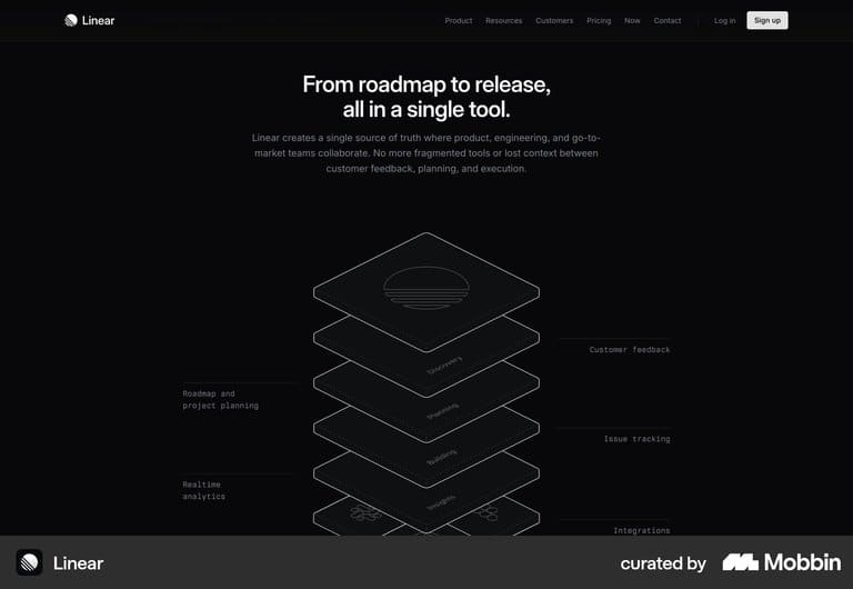
A monochrome layered diagram can explain how a product fits together. Restrained motion should support that explanation, not distract from it.
Proposal and build plan
The work is organised around five focused pull requests under Birch issue h3hq/birch#208. The opening priorities establish the shared marketing shell and the home page direction.
PR 1 · Shell
Add shared hero, headline and lead typography roles, and use one container width throughout. Retain Birch’s Paper v2.1 identity, including its IBM Plex Sans typography and Iris accent, rather than introduce page-by-page styling.
Use stock button variants for an ink “Get started” action and a ghost “Sign in” action. Keep video framing free of decorative shadows and keep every colour within the product palette.
Organise the footer into Product, Compare, Resources, Company and Legal columns. Move the theme switch there and make comparison and security information easy to find.
PR 2 · Home
Open with “HR for teams in India and the US.” Follow the grain hero band with billing-backed facts, then introduce statement-led storytelling and real product detail.
Reserve word reveals for key statements and numerical animation for verified facts. The essential message should remain readable without motion, with a clear path from understanding the product to getting started.
Your website, thoughtfully refined
We design elegant, mobile-first websites for small businesses across the UAE. From redesigns to WhatsApp integration, contact forms and ongoing maintenance, we help make the next enquiry easier.
Alderr & Page website plans start at 400 AED. Tell us what your website needs to do, and start with a free homepage preview.